
Google UX Design Certificate: Trinket Trove
UX Design
UI Design
UX Research
ROLE
DELIVERABLES
Mobile App
TIMELINE
CONTEXT
Designing an app for social good.
One of the prompts in the Google UX Design Certificate is to create an app for social good. Currently, there is no focused platform for the vast hobby of trinket collecting, fragmenting the hobby into many small and hard-to-find communities. Trinket Trove is an app that allows trinket collectors to have a dedicated platform for displaying collections, connecting with others over a shared interest, or having the ability to easily find and trade unwanted items with new ones.
With that in mind, the project aims to fulfil the following goals:
Building Community: Foster and strengthen communities through the use of “trinket troves”, a physical box placed in a location for people to visit and swap unwanted trinkets with new ones. Users can also facilitate other methods of building community through social media posts and peer-to-peer trading.
Sustainability: Increase sustainability by encouraging users to trade through the app instead of either buying from resellers or buying multiples on their own.
USER RESEARCH
To create an application that enriches user's lives, we need to know what they need.
The certificate this project was a part of did not require interviews to be done, so user research was done through empathy exercises and research into the comments of various trinket-based communities across social media. The initial research led to the key characteristics of my end users and the interview goals, leading to the information needed to determine user pain points.
All of the information gathered through these various exercises and methods helped create my user personas and their problem statements, the competitive audit and the value propositions for the application.
Information Overload
The app should have dedicated features towards streamlining and encouraging the trinket trading process
Excess Inventory
Help users to get rid of duplicate or unwanted trinkets by encouraging trade for items they want or helping with the physical trinket troves in their area.
Lack of Community
Allow users to display their collections, make posts and chat with others who have similar interests to foster connection and community.
MEET THE USERS
Create personas to inform the design process.
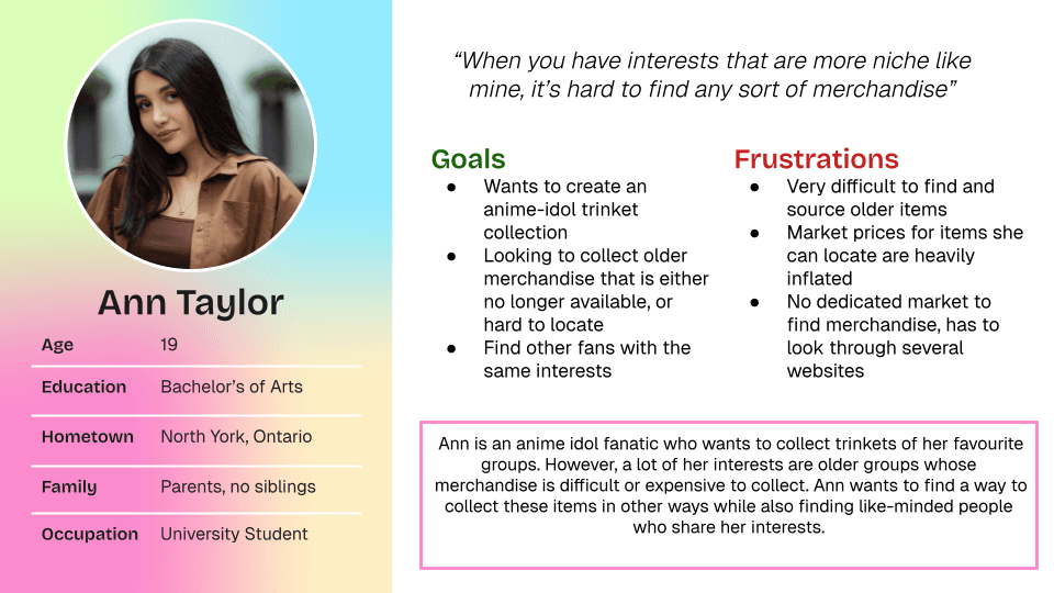
Using the pain points that I identified earlier, I created three user personas that each captured a subset of the requirements that need to be met when creating the application. I honed in on their goals and frustrations, then evaluating how the application would solve them.
COMPETITIVE ANALYSIS
Understanding the current landscape to find needs that are unmet.
Three competitors identified during the competitive audit were the Little Free Library, My Figure Collection and Worldwide Sidewalk Joy. My Figure Collection and the Little Free Library are two indirect competitors, while Worldwide Sidewalk Joy is a direct competitor. My Figure Collection offers a comprehensive database, lets users display their collection and the ability to source items, but does not have a proper community aspect. On the other hand, the Little Free Library and the Worldwide Sidewalk Joy both offer users the ability to locate nearby physical boxes to encourage community-building activities. However, they don’t allow for direct communication through public posts or private chats, and do not have other ways of facilitating trade.
WIREFRAMING AND LOW-FIDELITY
Initial explorations and the prototyping process.
Before tackling the low-fidelity prototype, I created 8 different paper wireframes in 8 minutes using the Crazy Eights/Rapid Sketching method to explore different ideas for what the application could look like. By choosing the best features, I was able to create digital wireframes and then low fidelity prototype suitable for user testing.
At this stage, the main user flow of the prototype included the login, browsing different pages, registering a trinket trove, and going through the trading process (from discovery to completion).
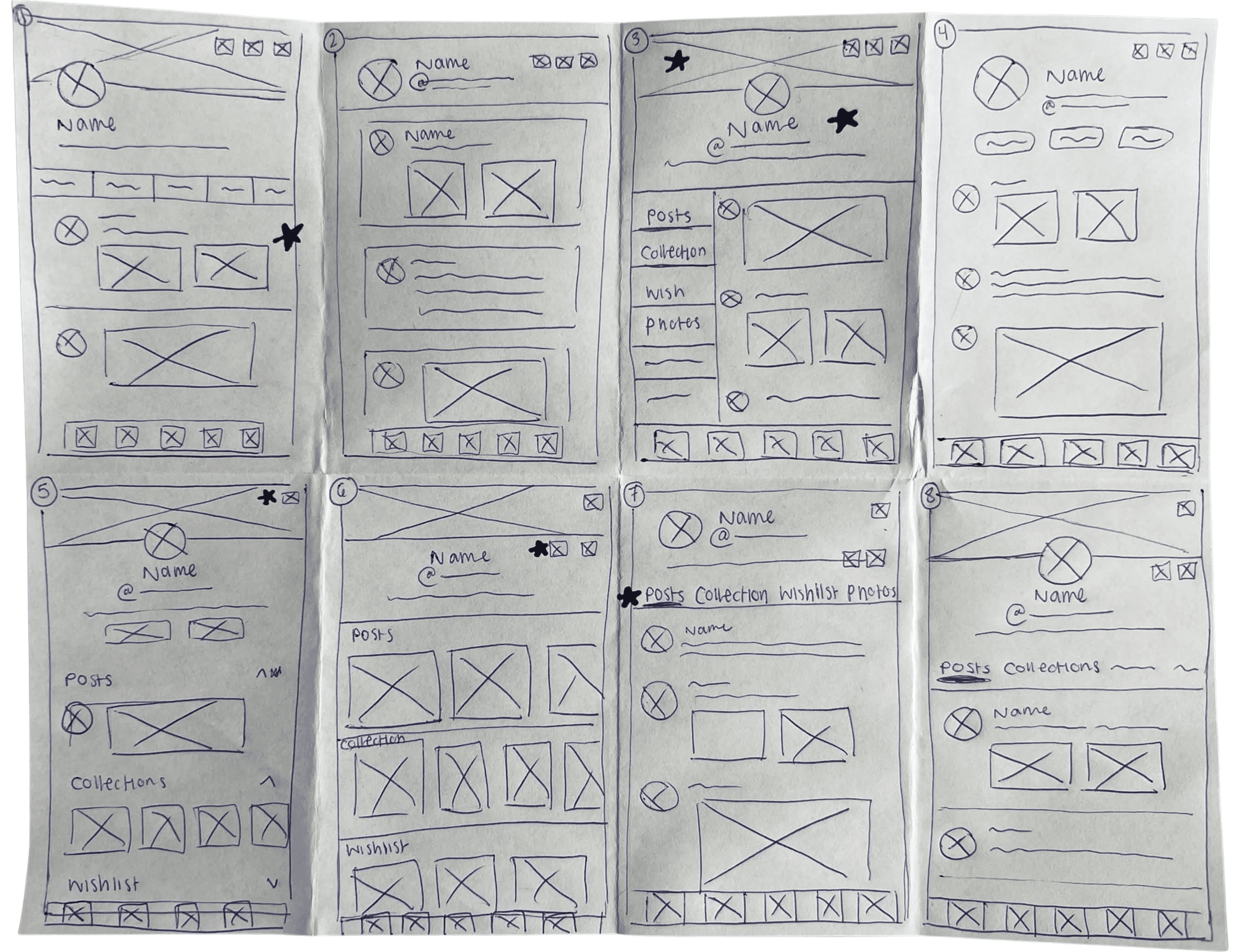

Paper wireframe iterations and a digital wireframe mock-up of the account page, with a low-fidelity prototype video of the app.
USABILITY STUDIES AND INSIGHTS
Collecting user feedback at every stage to refine interfaces and improve user flows.
By reaching out to close friends and family, I was able to conduct 7 usability studies. Each study was remote, unmoderated and lasted approximately 10-15 minutes. The first section was open-ended, while the next section included standard SUS scale questions to use as metrics to grade my application and serve as a benchmark for future usability tests.
The usability study for this project was very helpful as it shed a light on what elements of the UI worked well and what could be improved. Users agreed that all the common workflows were intuitive and familiar, and the changes suggested focused mainly on preferences, such as:
Adding clarity to app-specific terminology to make workflows more intuitive.
Flipping the order of buttons on trove details popup to prioritize common buttons more.
Adding additional CTAs to homepage to direct users towards different app functions.
Improving the onboarding process by explaining important terms for easier understanding.
DESIGN MOCKUPS
Iterating with user feedback.
Refining the design into high-fidelity mockups was the next step after receiving feedback from the usability studies. The example below tackled the confusion new users would have when onboarding to a unique app. These mockups now had clearer explanations for navigation through multiple call-to-action buttons on the homepage, alongside multiple ways to find a feature.
I implemented a search feature on the homepage for users to use when searching for any term. The results page is sorted by posts, users, posts from trove pages and market listings for easy access.

DESIGN SYSTEMS
Increasing efficiency through standardization.
To keep consistency throughout the app design, alongside being able to make quick changes to all the screens, I implemented a design system that consisted of the typography, colour palette, and various components that made up the application.
Learning and creating a design sheet helped significantly reduce redundancy whenever changes had to be made.

HIGH FIDELITY PROTOTYPE
Bringing it all together.
After working closely with the user feedback from the usability study and creating all relevant screens for the application, the high-fidelity prototype was made with animations, also mimicking the final product as closely as possible.
The primary user flow continues to be similar to the low-fidelity prototype in order for users during the study to have a comparative framework.
You can test the prototype for yourself here!
FINAL DESIGNS

TAKEAWAYS!
What I learned and what I would do differently:
Directly following up from the responsive grocery store app and website, Trinket Trove is now my final project for the Google UX Design Certificate. I felt that I was able to build upon the skills I gained during the first project and refine my techniques to create both a better user experience and a best practice for myself. Going forward, some next steps for this application would be as follows:
Improve accessibility compliance by creating alternate interfaces with alt text instead of images for compatibility with screen readers.
Add alerts to notify users when items on their wishlist are available to be traded for on the market.
Creating a way for users to interact with and contribute to the trinket database, allowing for complex queries so users are able to find details of trinkets that they are looking for.